ux-nickpanaccione
My First Session with Pro Tools
Usability Journal Entry 1
One of the more controversial UX designs I have ever used is Avid’s Digital Audio Workstation Pro Tools. Pro Tools was released in 1991 and was originally designed to replace tape in professional recording studios. I was first introduced to Pro Tools in 2023 after being told it was the “Industry Standard” for recording. While I had experience with multiple other DAWs, mainly Ableton and FL Studio, Pro Tools felt like a major step backward and was much more difficult to learn.
My goal with Pro Tools was to create a session and record a simple song. ***
Session Setup
The first thing Pro Tools shows you is a session creation dialog where you set the name, file location, and sample rate. This was fairly standard, but after opening the session, I was met with two separate windows launching at the same time. One was filled with colored bars along a timeline, and another was covered in faders and knobs resembling a mixing console.
My experience with other DAWs told me one of these was probably a timeline, so I closed the other one and focused there. This is an example of a mental model, where the internal assumptions of a user carry how something should work based on past experiences. My mental model showed me that one window has the timeline for editing audio. Pro Tools gives little to no guidance on this. There are no labels explaining the windows or why two windows exist. ***
Creating Tracks
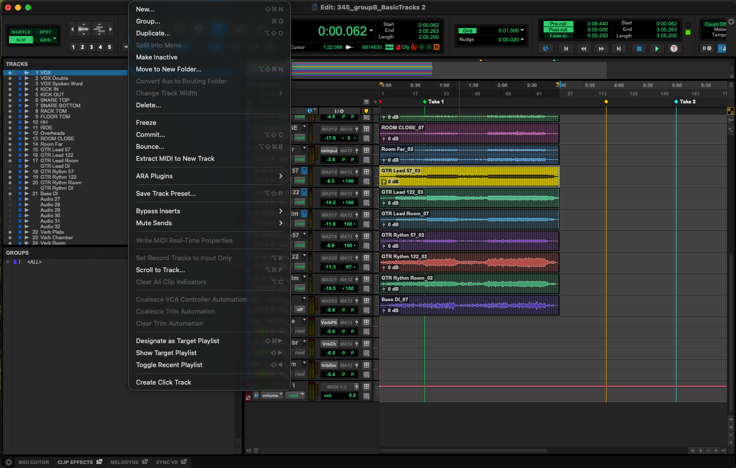
Following my Mental Model, I knew I should start by creating my tracks. In every other DAW I had used, projects opened with at least one track and had a simple button to create new tracks. Pro Tools opened with neither. After clicking through multiple menus, I found a blank hidden tab named “Tracks” . This had no buttons to create tracks and no additional markings to show me where to look. After stumbling around the App a bit more, I finally found a New Track button under a sub-menu, along with a key bind to create new tracks. After clicking this, the Track menu populated, and I had successfully made my first track.
This was a problem of affordance. Affordances are cues that designers use to show what it can do and how to do it. Here, a simple plus marking or Create New button could have easily shown the user how to create a new track. Instead, Pro Tools focuses on flexibility and efficiency of use. While it was not initially clear how to achieve my goal, I now know a simple key bind to create tracks, instead of clicking through menus. The interface is uncluttered, but this cleanliness comes at the cost of discover ability.
 ***
***
Recording
Once I had my tracks created, I found the transport bar at the top of the screen, the row of buttons for play, stop, rewind, and record. The record button is a red circle, the universal symbol for recording, so I pressed it. Nothing happened. After a quick Google search, I learned about how Pro Tools uses “Armed” tracks to record. We must click a smaller red button directly on the track itself, then press the record button in the transport bar, and finally press play. Three separate steps are required to record audio into a track, and the record button resets every recording. The main record button looks like it should start the recording, but does not function on its own. Simply graying out the recording button until tracks are armed can clear up this issue.
Mixing Window
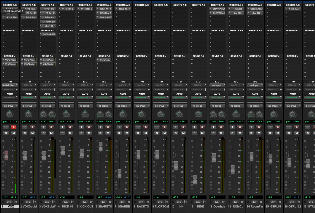
After recording my audio, I needed to mix my tracks by adjusting things like volume, panning, and adding effects like reverb or compression. This all happens in the Mix Window, which I had closed earlier. To reopen this window, I had to dig through more menus to finally discover a keybind to switch between windows.
This window is a clear example of skeuomorphism, where digital interfaces are made to look and behave like their physical counterparts. Every track appears as a vertical channel strip, with a fader at the bottom, a pan knob, and rows of effect slots at the top. For audio engineers and producers who spent time on analog consoles, this is a natural map of an interface they already know. For me, I had the opposite experience. I had never used a hardware console, so the visual representation meant nothing. The effect slots at the top of each channel, called inserts, are just empty grey boxes with no label and no indication of what goes in them or how. Clicking one opens a drop-down of every installed effect, sorted into nested folders.
Pro Tools is intentionally designed with skeuomorphism in mind for large studios. Every friction point I ran into came from the fact that the design is made for experts and assumes new users will learn its intricacies to use the app. Things like Pro Tools’ natural mapping of the timeline and Mix Windows work great once you understand them, but without experience in recording this way, learning Pro Tools becomes a monumental task.