ux-jacobBuhler
When the Direct Route Doesn’t Work
Navigating Tassel Login Confusion
As a student at Chico State who is graduating this semester we were told to register through tassel. When I first tried to log in, I assumed the process would be straightforward: navigate to the Tassel website, click Chico state, enter my credentials, and I’d be in. The interface looked professional, everything seemed in order, and I had my email and password ready. But that’s not what happened.
The Problem
When I tried to log into Tassel directly using the main Tassel login page, I entered my email and password, the exact same credentials I use for everything else at Chico. I double-checked them, made sure there were no typos, and hit enter. But instead of being logged in, a wrong credentials error appeared. I was really confused as I knew I had typed everything correctly but now Tassel is telling me that I’m wrong. I fully expected this to work. For starters the website is literally csuchico.tassel, and I knew for sure I had the correct credentials. I did everything right on my end. But instead of getting into my account or getting helpful feedback, I got an error message I knew was wrong. This created what’s called a “mental model mismatch” . My mental model of how the system should work didn’t match the actual system’s behavior. I expected to enter my credentials and then login. What actually happened was I entered my credentials, there was some type of error, and then was stuck at a dead end.
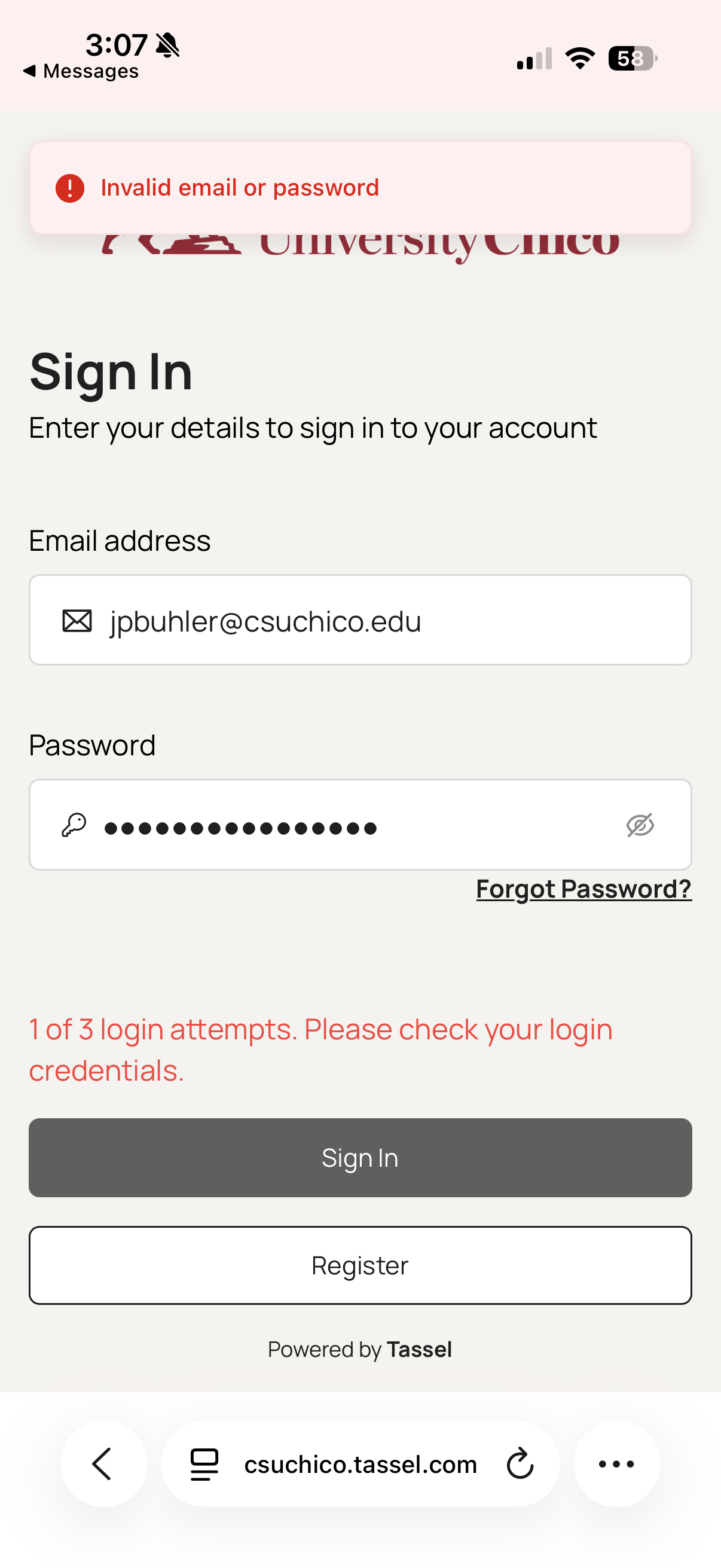
Discovery and the Workaround
After staring at that unhelpful error message for a minute, I decided to try a different approach. Instead of going directly to the Tassel website, I went to the main Chico State website and looked for a link to Tassel there. After enough searching, I eventually found it. Chico has a link to Tassel buried in their main site. It was the logical place to look for student resources. I clicked the link and it took me to what looked like the exact same login page. Same design, same form fields, same everything. So I used the same credentials and just like that I was in.
I was immediately confused. Why did it work this time? I used the exact same login credentials. The form looked identical. But somehow, coming through the Chico website link made all the difference. This is really strange from a user perspective because there’s no indication that there are two different ways to access Tassel, or that one of them doesn’t work.
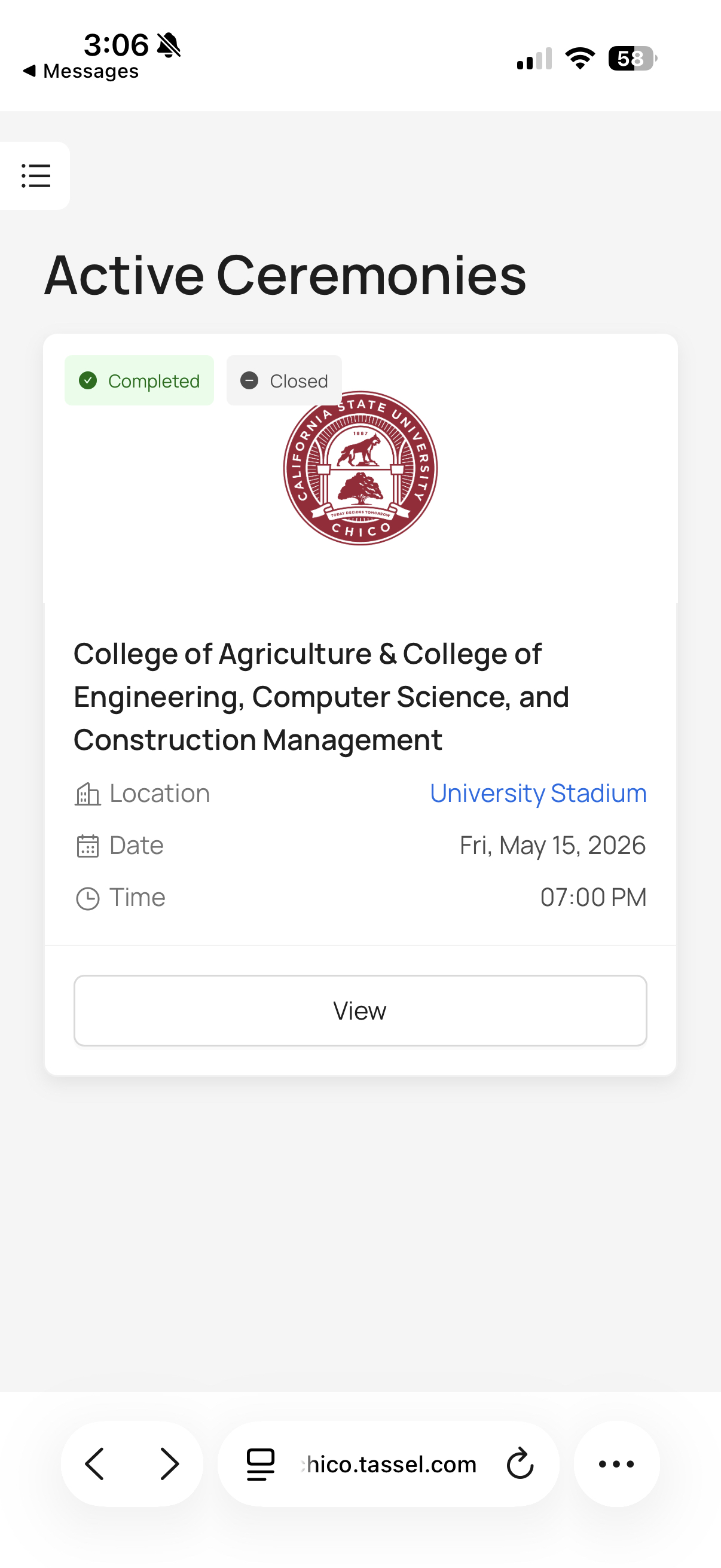
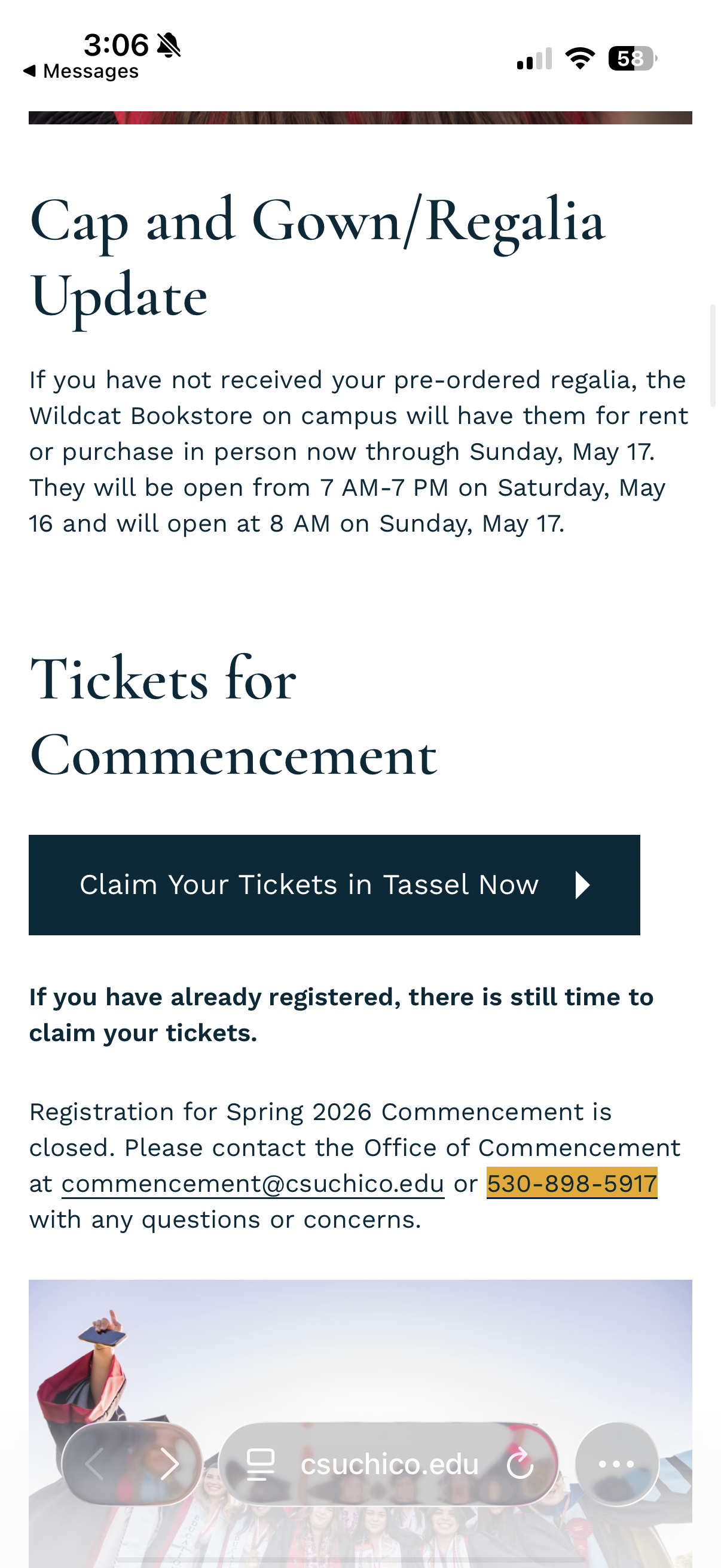
Once I logged in I could see the ceremony information for my graduation, exactly what I needed in the first place. But getting here required discovering a workaround that shouldn’t have been necessary.
Why This Matters
Looking at this experience, I realized it demonstrates several important UX concepts and breaks some fundamental usability principles. This isn’t just an annoying glitch, it’s a case where the system’s design contradicts how users naturally expect it to work.
One usability heuristic called “Match Between System and Real World” is all about using familiar concepts to make interfaces intuitive. In the real world, a login page is pretty straightforward: you see a form, you enter your credentials, and you get in. That’s the mental model most users have. But Tassel’s direct login breaks this expectation without explanation. A user with no prior knowledge would assume the direct route is the correct one, because that’s what you’d expect in the real world. The system should match that expectation. Fundamentally, this is a problem of poor information architecture and lack of coordination between systems. Having two access points to the same service, where one doesn’t work, is confusing and frustrating. Users shouldn’t have to discover a hidden workaround.
Possible Solutions
Option 1: Fix the Direct Login (Best Long-Term Solution) The ideal fix would be to repair whatever is broken with the direct Tassel login so it works for everyone. This way, both access paths work, and users have flexibility in how they access the system. If there’s a technical reason the direct login can’t work, that reason should be eliminated.
Option 2: Automatic Redirect If fixing the direct login isn’t possible, Tassel could automatically detect when the direct login fails and redirect users to the working link. This would create a seamless experience where users don’t even realize there was an error—they’d just end up at the correct portal.
Conclusion
This experience with Tassel taught me that good UX isn’t just about making things look nice, it’s about understanding how people naturally expect systems to work and either meeting those expectations or clearly explaining when you can’t. The Tassel login problem was frustrating because the system broke a fundamental mental model (you can log in where the login form is) without providing any guidance on what to do instead.
By fixing the direct login, providing better error messages, or simply being more transparent about which access method works, Chico could turn a confusing experience into a smooth one. That small improvement would save hundreds of students from the frustration I experienced, and that’s what good design is all about.