ux-Tiggzzz
Using Remaining SNAP Balance at Checkout
When it gets closer to the end of the month, my SNAP/EBT funds begin to run low or even reach zero. As a college student it’s my priority save as much money as I can, so often I want to use all my SNAP funds. A common technological interaction I run into is when I try to make a purchase with a greater total than my remaining SNAP funds. In this situation I would like to use all of my remaining SNAP funds and subsequently cover the remaining transaction total with some other payment method. However instead the transaction is overall declined.
The transaction shown bellow is an example of a declined transaction with a sale amount of $6.87 and a SNAP balance of $4.34.
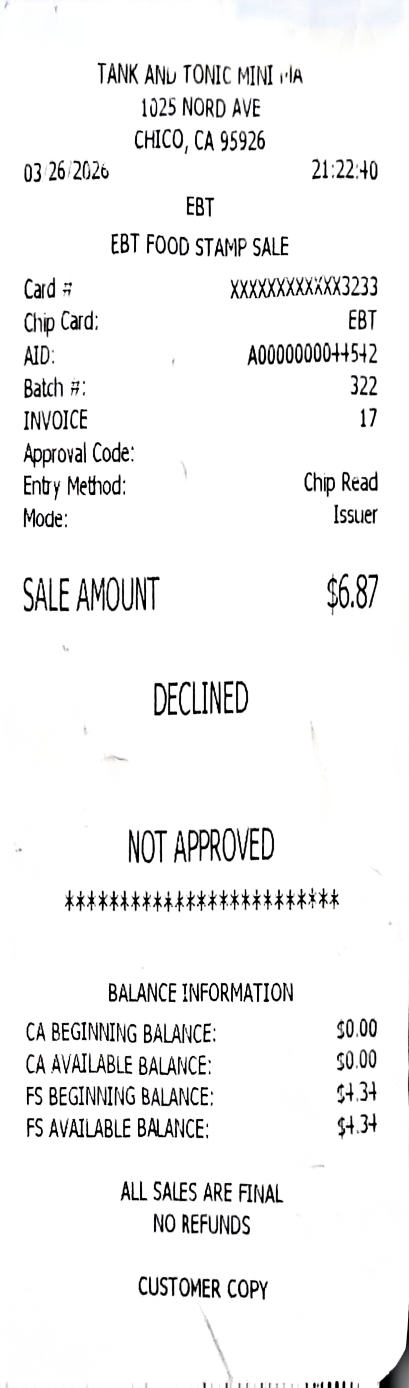
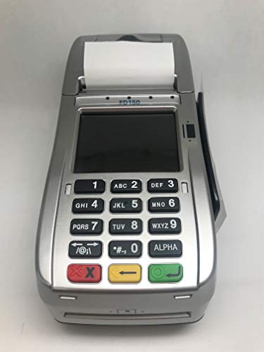
The interaction shown above involved inserting my EBT card into a card terminal, entering my PIN, seeing a “Declined” message, and receiving the receipt shown above. After my transaction was declined, I asked the clerk if she could use my remaining balance. She then manually created a transaction to equal my remaining SNAP funds and asked me to reinsert my EBT card and input my PIN again. After that transaction was approved, she created a third transaction with the difference that wasn’t covered, and which I paid using my debit card.
This experience ultimately required three separate transactions. The system’s Conceptual Model (how the system is designed to work) conflicted with my Mental Model (my expectation of how it should work), where I anticipated completing the purchase in only two transactions.
I believe that this interaction could be improved by replacing the generic “Declined” message with more informative actionable feedback. Instead of displaying only “Declined,” the system could present one of two messages depending on the situation.
If no funds are available, it could display:
- “Declined”
- “Use another payment method.”
If some funds remain, it could display:
- “Insufficient Funds”
- “Use Remaining Balance?”
- “YES ◯, NO ✕”
This design would better utilize the terminal’s Affordances (visual or physical cues that suggest how to interact with the system), such as the green button for confirmation and the red button for cancellation. It would also improve Mapping (the relationship between controls and their outcomes), as the symbols (○ and ×) clearly correspond to the button functions, making the interaction more intuitive.